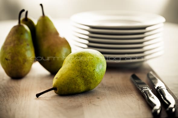
At the core of all photography lies subject, composition and lighting. If those three things are poor, no amount of post-processing work will fix it. It won’t matter what your aperture, f/stop or ISO is if you don't have an interesting subject, good composition, and great lighting. Without these, a photo will lack impact.
Learning how to effectively read a photograph will give you better insight into how to achieve those crucial elements in your own work.
Reading a photograph is the study of how a particular image was created and the thought process of the photographer behind it. Photographers constantly make decisions about lighting (quality and quantity), composition (the arrangement of visual elements) as well as content (subject and meaning) when taking photographs.
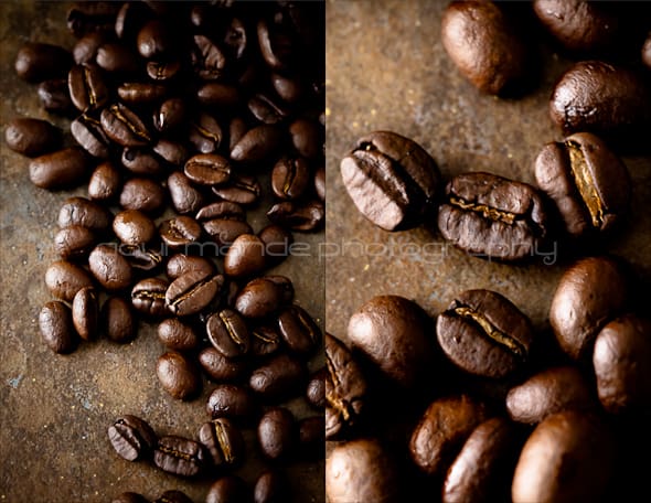
Every image offers a variety of interpretations and by observing and interpreting the choices a photographer has made in each we can learn and improve our own skills. To become better photographers, we have to spend time looking at what other photographers are doing and learn from each other.
Of course, you may already instinctively know what you like, but by learning how to analyze the basic visual elements a photographer uses to communicate with, you will better appreciate and understand what you like or don't like about a particular image.
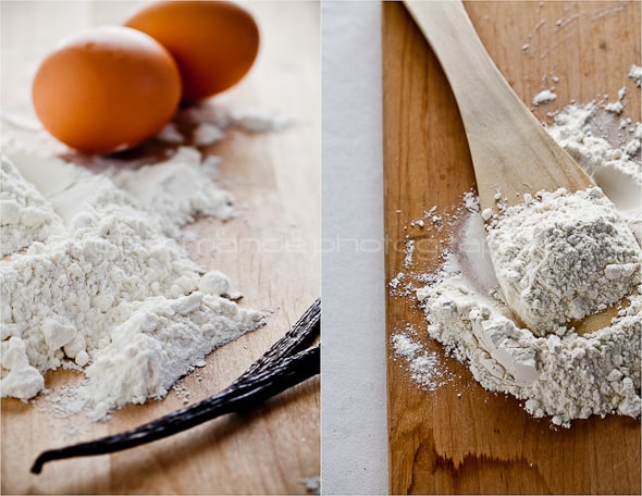
As I mentioned, a successful image depends on a number of things that must come together including: lighting, composition, and subject matter, but for part I of this discussion I will be focusing on the basic building blocks of all visual arts – the elements of design.
Keep in mind that understanding these various elements are only guidelines and you should also follow your instincts. Don’t be afraid to experiment and try something different, learn from your successes as well as your failures. Surround yourself with others that share your enthusiasm and you will improve your skills quickly.
The Visual Elements:
Not all of the elements may be present in an image at one time. What you choose to include or exclude makes up the elements that engage a viewer’s attention.
1. Lines
Lines are effective visual elements because they lead the viewer’s eye. They draw the eye to key focal points in an image; they imply motion and suggest direction. A line can be straight, curved, vertical, horizontal or diagonal. A line can be implied when several points are positioned strategically within the frame. Through linear perspective, lines can also create a sense of depth to an image. Generally a vertical orientation is used for images with predominantly vertical lines and horizontal orientation for images with predominantly horizontal lines.
Question to ask: What lines do you see; how they are arranged within the frame of the image, where is your eye drawn?
2. Form/Shape and Space
Forms are three-dimensional shapes; shapes can be irregular and organic (as found in nature) or geometric (ex. circles, triangles, and squares). Space is defined and determined by forms and shapes, it is the area between and around objects. The shapes in an image create positive space, while the spaces around these shapes are the negative spaces. It is important to be attentive to the negative space as well as the positive space. Increasing or decreasing the amount of space around an object affects the image. Shapes can be made more dominant within a composition by placing them against a contrasting background.
Question to ask: Do you see organic or geometric shapes; what are they, how do they impact the image?
3. Color
We respond to color on many levels. Color defines and accentuates lines, shapes, forms, and space. Color can add interest and draw the eye to the focal point or, conversely, can distract the viewer away from it when used incorrectly. Color also impacts mood; certain tones have a calming effect, while others convey vibrancy and energy. There are three main components of color: hue (the shade of a color), value (the lightness or darkness of a color), and saturation (how vivid and intense a color is).
Question to ask: What colors are used in the image; bright or muted, light or dark, how do they affect the mood?
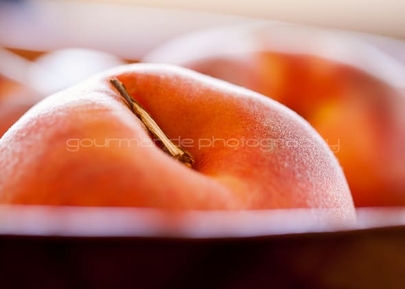
4. Texture
Texture is the surface quality of the objects in the image. Textures can be rough or smooth, soft or hard. We experience actual texture when we touch objects and feel their roughness, smoothness or patterns, which we can simulate or imply in a photograph. Textures are highlighted when light hits objects from different angles.
Question to ask: What textures are highlighted; how do they work with the other elements?
These elements of design are the basic components of composition; they are the structure of the image and provide the photographer with a set of tools to begin working with. A successful and harmonious composition is achieved by integrating these basic tools with the concepts of the principles of design which will be the subject of part II of “The Language of Photography” and the beginning of an ongoing series on photography and food photography here.
I'll be discussing the following concepts next time:
Balance
Movement
Pattern
Proportion
Send in your very best images that highlight any of the above concepts and I'll include a selection of them in next week's post as examples!
You can email them to me at gourmandeinthekitchen[at]gmail[dot]com or leave a link to the image in the comments section below. I can't wait to see your submissions!
Read part 2 of the food photography series: The Principals of Design
Read part 3 of the food photography series: Prop Styling with Paula Walters
Read part 4 of the food photography series: Food Styling Q &A with Tami Hardeman

Sylvie Shirazi is the recipe developer and food photographer behind Gourmande in the Kitchen. For the last 10 years she's been making eating more healthfully easy and accessible with gluten-free, grain-free, paleo and vegan recipes that are free from processed ingredients.




[...] The Language of Food Photography from Gourmande in the Kitchen [...]