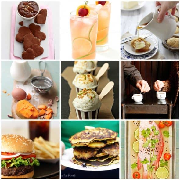
Photography is what one “sees”. When two people look at an image, each one will “see” it differently. After all, art is personal expression.
That being said, there are certain principles that create the foundation of great artwork. Keeping these few principles in mind while composing your image can greatly enhance your photography.
Seeing creatively is an important aspect of photography. In an image there can be various shapes, lines, colors and other elements of design; it is the interaction between these elements that defines how compelling an image is.
The principles of design
The principles of design are concepts used to organize and arrange the structural visual elements of design that we discussed last time. The principles integrate the elements and build on each other. A good way to think about a principle of design is that it is something that can be repeatedly applied with the different elements to produce unity and harmony in a composition.
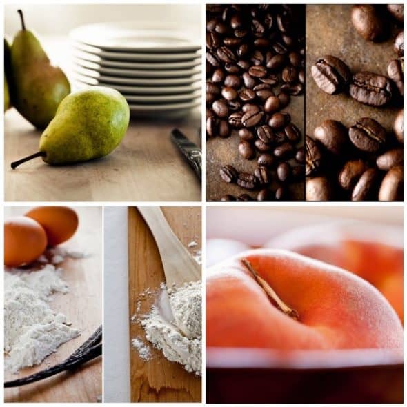
The art of composition is the ability to effectively arrange the various elements of an image in such a way that the resulting photograph expresses what you want to communicate. It’s very likely that you may already intuitively arrange elements so they "look right" but learning these principles of design may help you to better understand how to communicate with your audience and create the image you are after.
1. Balance:
Balance refers to the arrangement of objects and the visual equilibrium they create in an image. Balance is created when lines, textures, colors, and shapes are combined harmoniously, equalizing the visual impact of each element in the image. The elements within the composition have a sense of “weight” visually, the positioning of which can leave an image feeling either balanced or unbalanced.
An unbalanced image will feel like there is something missing and causes discomfort for the viewer; this is different, however, from an asymmetrical composition. In a symmetrical composition elements are evenly placed in an image or the two sides of the composition mirror each other.
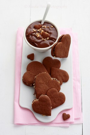
Chocolate Nutella Alfajores by Xialou Hou (6 Bittersweets)
An asymmetrical composition is when visual elements are unevenly placed in an image. Both, however, can be successful.
Although asymmetrical balance often appears more casual and less planned, it takes greater thought to balance larger objects against smaller ones, or large areas of color against smaller areas. The position of the elements is critical in an asymmetrical composition; a heavy visual weight on one side can usually be balanced by a lighter one on the other.
2. Movement:
Movement in an image can be both literal and compositional.
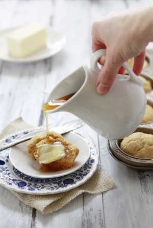
Literal movement is actual physical movement in the image. Examples of literal movement in food photography include: pouring, shaking, tearing, and eating. Compositional movement is the movement of the viewer’s eye through the composition to the areas of emphasis.
Unlike sequential art forms such as music or film, a photograph is revealed to the viewer at once. The photographer needs to create an area of emphasis, a focal point, which will lead the viewer through the frame as they take in the whole image.
Compositional movement can be directed by lines, shapes, or colors. For example, two similar shapes, even on different sides of an image, will lead the eye from one to the other.
3. Pattern:
Pattern is the repetition of elements such as shape, texture or form. Patterns create a rhythm that the eyes enjoy following and give a sense of structure to an image. Rhythm is based on repetition; an easy way to achieve rhythm is by using similar shapes.
There are different ways to use patterns. It can be used as the main subject but is more often used as a supporting element to enhance a composition. Supporting element patterns strengthen and add interest to your main subject.
When lines, shapes, and colors within a picture occur in an orderly way, they create patterns that can enhance the focus of an image. Pattern, like texture, is found almost everywhere; you just have to keep an eye out.
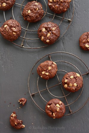
Outrageous Chocolate Butterscotch Cookies by Xialou Hou (6 Bittersweets)
4. Scale and Proportion:
Scale and Proportion are closely tied to one another and affect the overall feel of an image. When an image lacks proper scale and proportion it can feel unsettling but when used well, they give an image a feeling of harmony.
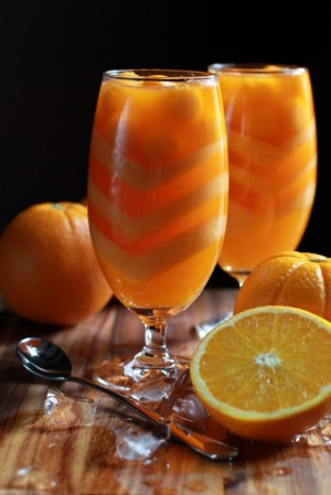
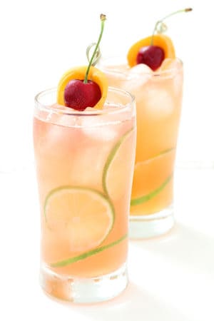
Orange Jelly by Azlita Aziz (Masam Manis)
Scale refers to the overall size of an object within the frame. Proportion is the relative size of objects to one another. A good example of proportion in terms of food photography would be the relationship of the food and the way it is plated.
The principles of scale and proportion are also tied to emphasis and focal point. Don’t be afraid to experiment with scale and proportion, sometimes an intentionally over-scaled object can become a focal point and can have a dynamic effect on an image.
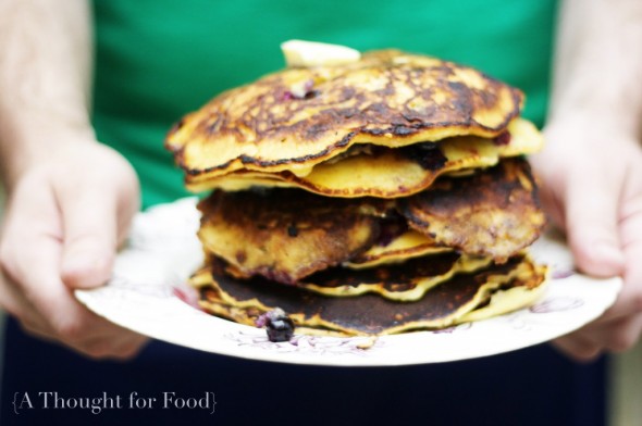
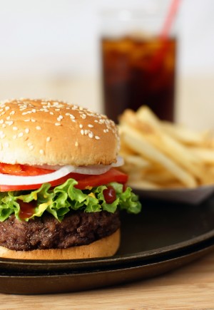
Blueberry Pancakes by Brian Samuels (A Thought for Food)
The end goal is to keep the visual elements and principles of design in mind when composing an image.
When creating your image ask yourself: How do things look? Does what you see in the viewfinder match with what you envisioned? How can you use lines, shapes, space, colors and texture to create a sense of balance, movement, pattern, or proportion?
Everyone’s creative process is different; experiment and find what works for you.
(A big thank you to everyone who took the time to send in their photos)
Read part one of the food photography series: Learning the Visual Elements of Design.
Read part 3 of the food photography series: Prop Styling with Paula Walters
Read part 4 of the food photography series: Food Styling Q &A with Tami Hardeman
Coming up soon in the photography series is going to be a Q&A with a food stylist and she wants YOUR questions!
So if you've ever had anything you've wanted to know about food styling this is your chance to ask. Just leave your question for her in the comments or you can email them to me at gourmandeinthekitchen[at]gmail[dot]com.

Sylvie Shirazi is the recipe developer and food photographer behind Gourmande in the Kitchen. For the last 10 years she's been making eating more healthfully easy and accessible with gluten-free, grain-free, paleo and vegan recipes that are free from processed ingredients.




Shobelyn Dayrit says
This is a very informative site. I am a new blogger and I really need this info in order to take better pictures. It is however very overwhelming. I am getting headache with all these information that I needed to learn. I am excited and I am willing to learn because I finally found my passion in food photography. Thank you.
TRW says
DAAAMM!! im hungry now!!! ill take all of that to go please!!
Martyna @ Wholesome Cook says
Hi Sylvie, this is a fantastic series! While my food photography has gone from Zero to semi-professional level in the last couple of years, this series shows that there is always more to learn! Thank you so much for having put these together 🙂